Revitalizing Siteimprove's brand for clarity and impact
Company
Siteimprove
Industry
B2B SaaS (Martech)
Role
Art Director • Led a team of 2 designers
Responsibilities
Brand Strategy • Visual Identity • UX/UI Design • Prototyping • Design Direction

Overview
Siteimprove initiated a strategic rebrand to address a growing gap between its strong market presence and the clarity of its messaging. While the brand was well-established, its value proposition was not always immediately understood by customers. The goal of this initiative was to reposition Siteimprove as a platform-driven, customer-centric martech leader, aligning its identity, messaging, and user experience with evolving customer expectations. As Art Director, I led the visual and digital transformation, ensuring the new brand direction was translated into a cohesive and intuitive experience across all touchpoints.
GOALS
01.
Shift from product-led to platform-driven narrative
Transition the brand perception from a collection of tools to a unified platform that solves broader customer challenges. This required simplifying messaging and creating a more cohesive storytelling framework.
02.
Improve clarity and user understanding
Ensure users can quickly understand what Siteimprove offers and how it helps them. This meant refining both content hierarchy and visual communication to reduce friction and ambiguity.
Process
Upon taking ownership of the rebranding initiative, I began by evaluating the existing website and brand experience to identify gaps in clarity, structure, and messaging. This foundational work ensured that all design decisions aligned with the new strategic direction. I collaborated closely with cross-functional teams to ensure alignment between brand, marketing, and product throughout the process.
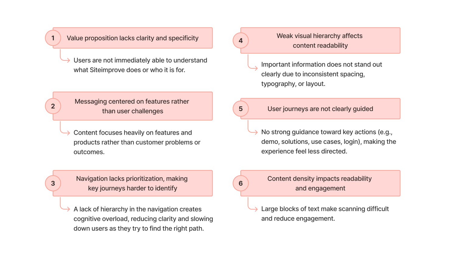
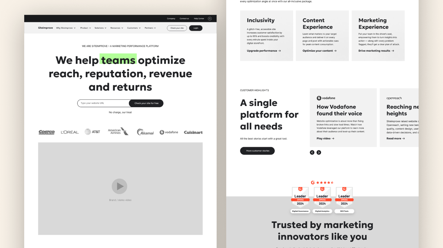
Current Website Audit
I conducted a full audit of the existing website to identify gaps in messaging clarity, inconsistent visual elements, and navigation pain points. These insights directly informed both the new structure and design direction.
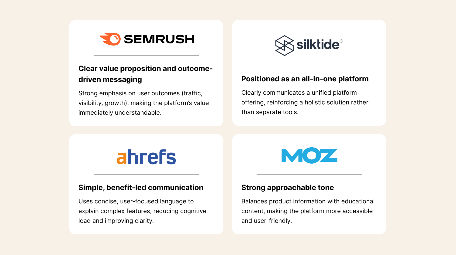
Benchmarking & Research
I analyzed competitors and best-in-class SaaS platforms to identify patterns in messaging clarity, navigation systems, and conversion-focused layouts. This helped define standards for a more modern and user-friendly experience.
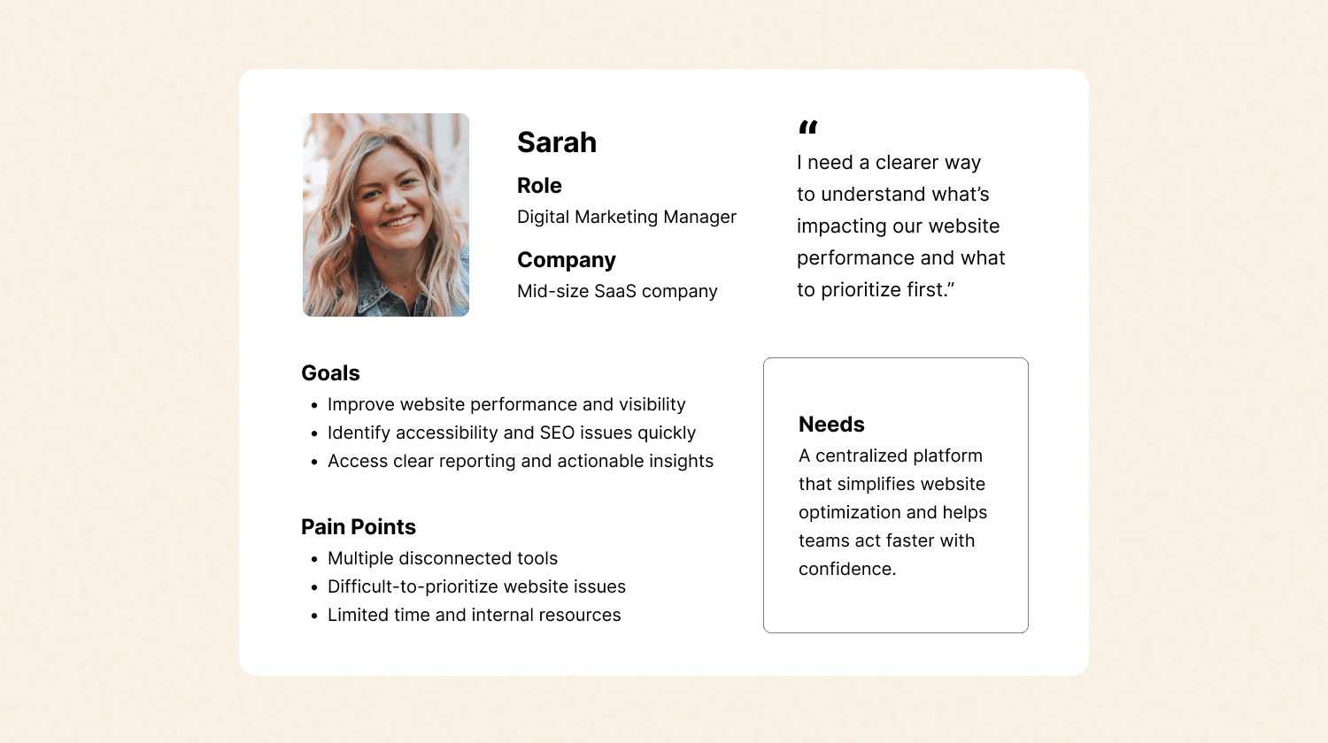
User Personas
To better understand customer needs and behaviors, I collaborated with the Product Marketing team on the creation of audience personas. These profiles helped align messaging, structure, and design decisions around real user goals and pain points throughout the rebranding process.
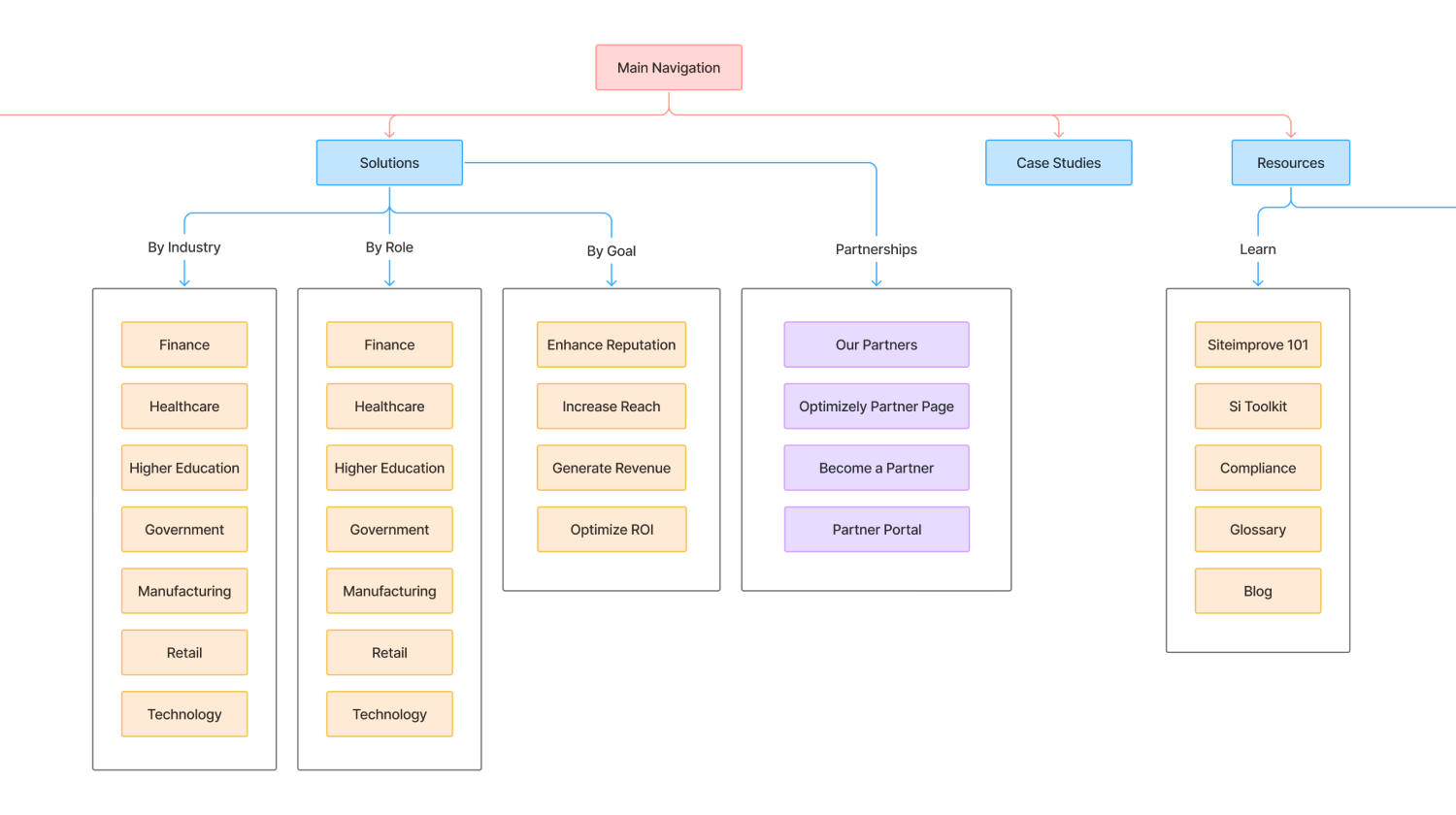
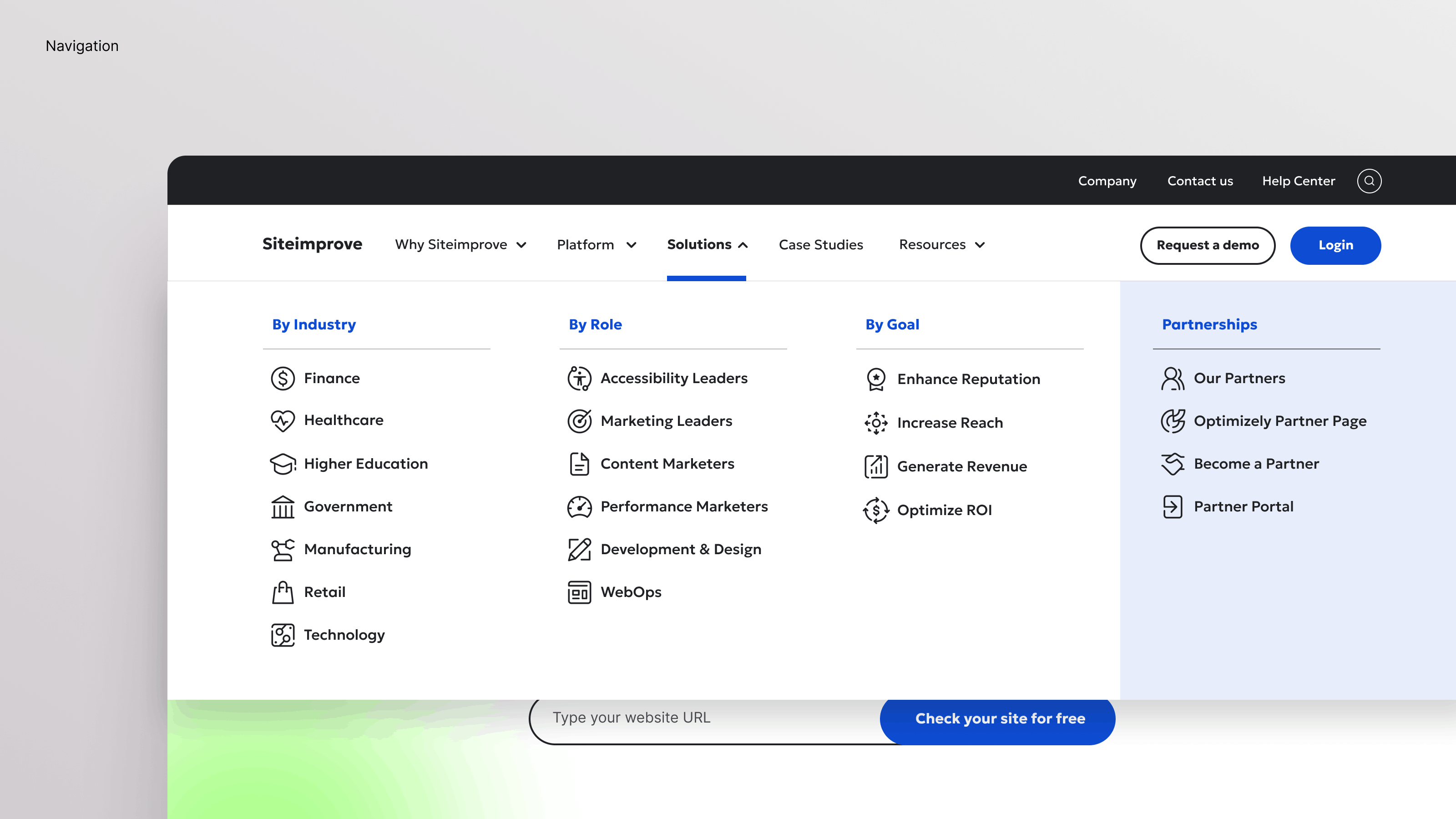
Information Architecture
I redesigned the website structure to better reflect the platform approach and user needs. This included creating a simplified sitemap, grouping content by user goals rather than product categories, and ensuring intuitive navigation across all levels.
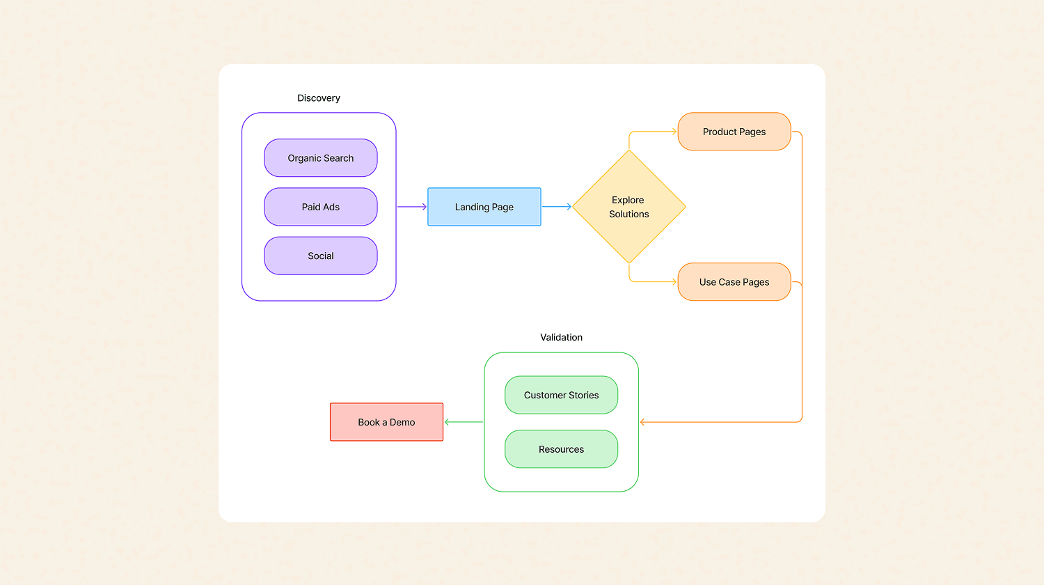
User Flows
I mapped key user journeys to better understand how visitors navigated the platform and accessed core solutions. These flows helped simplify navigation paths and create a more intuitive experience aligned with user goals.
Wireframing & Prototyping
Starting from the new sitemap and user flows, I developed low-fidelity wireframes, and an initial prototype. This allowed early validation of structure and usability, ensuring a solid foundation before moving into visual design.
Solution
Working closely with the Brand team, as well as accessibility specialists, developers, and UX/UI designers, I led the development of a cohesive visual and digital system that translated the new strategy into a clear and consistent user experience.
01.
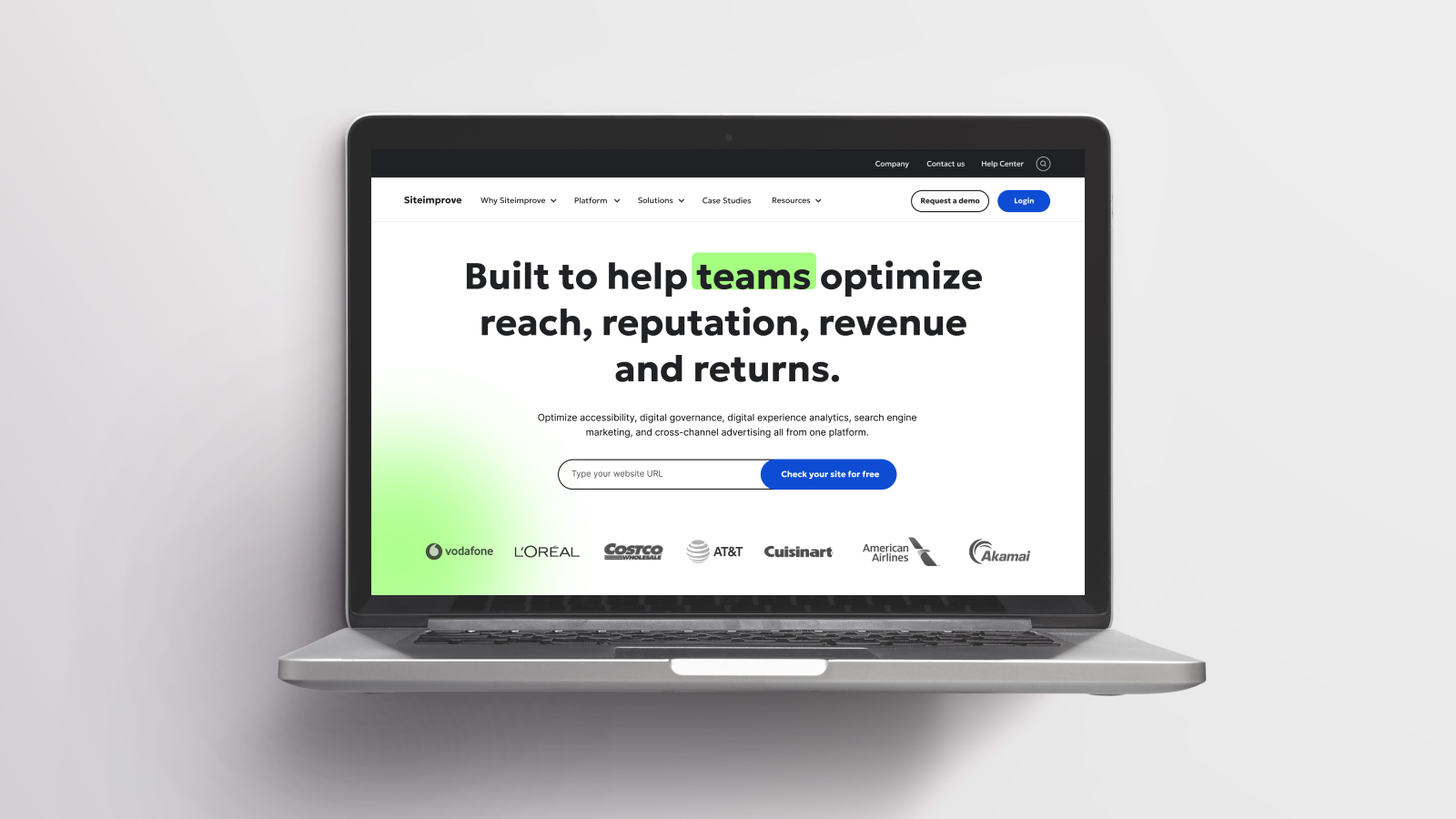
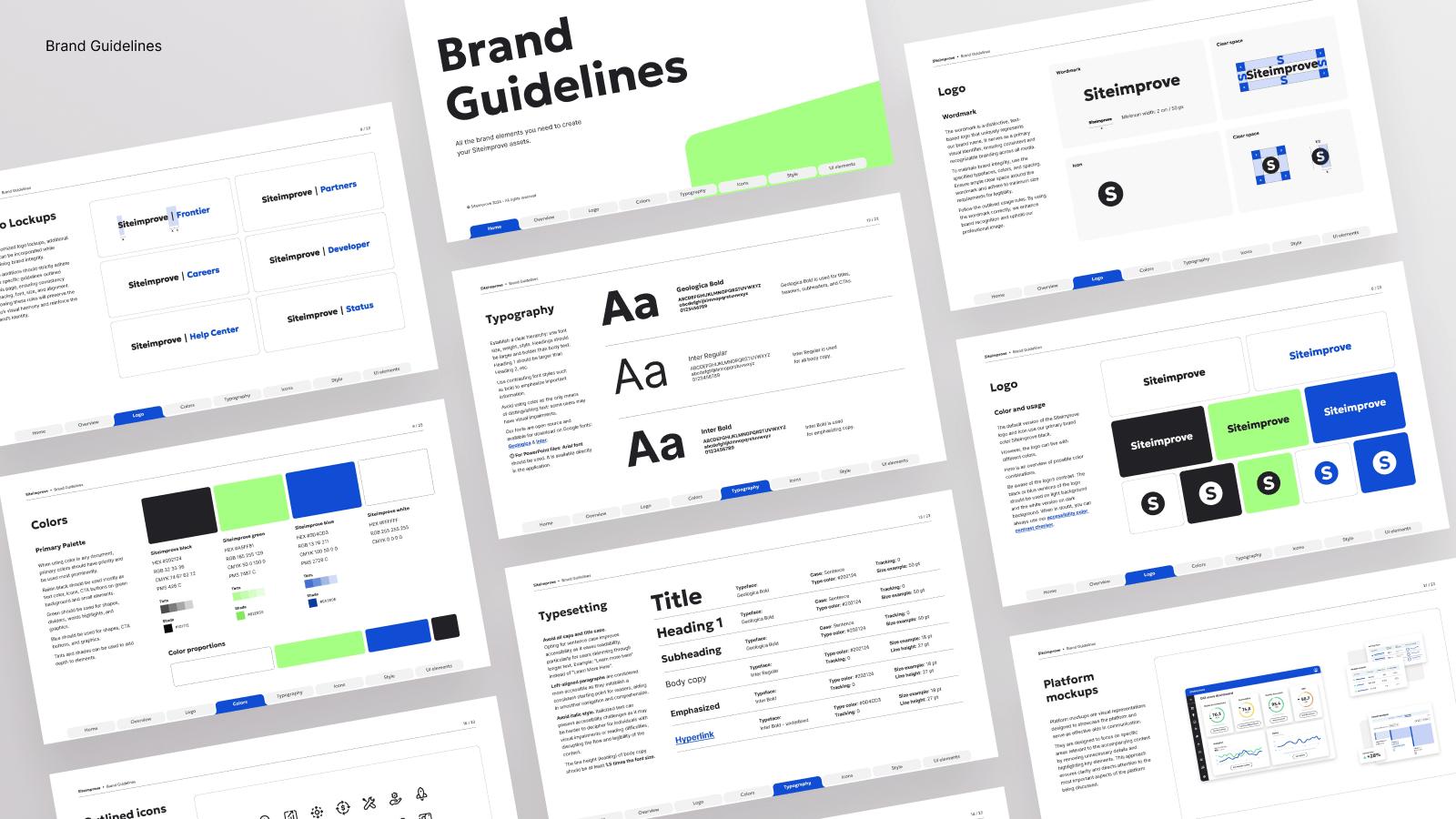
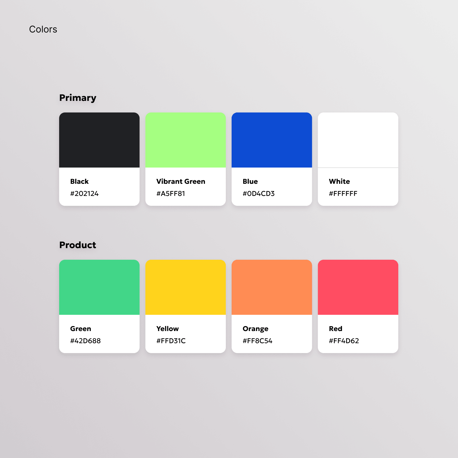
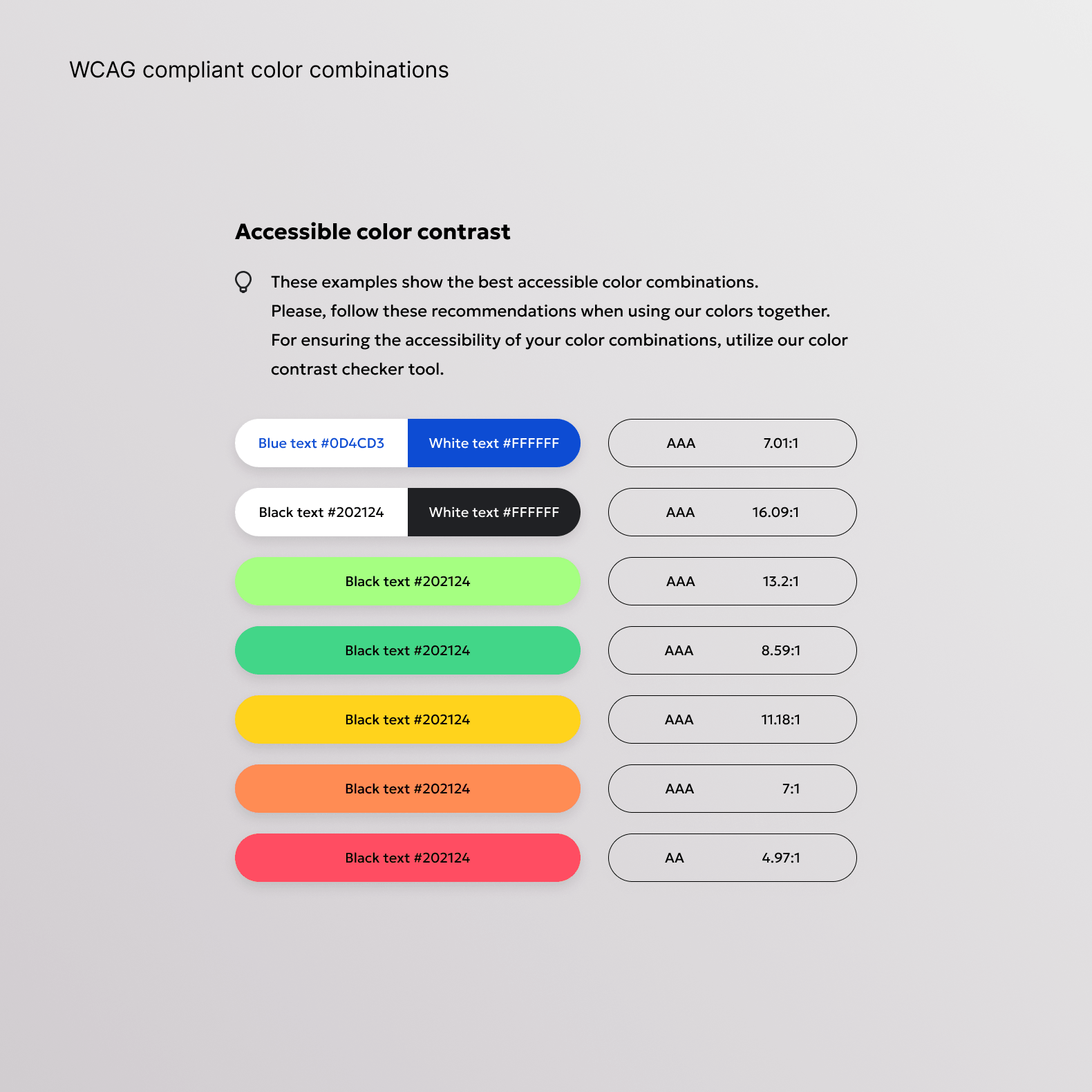
Brand Identity
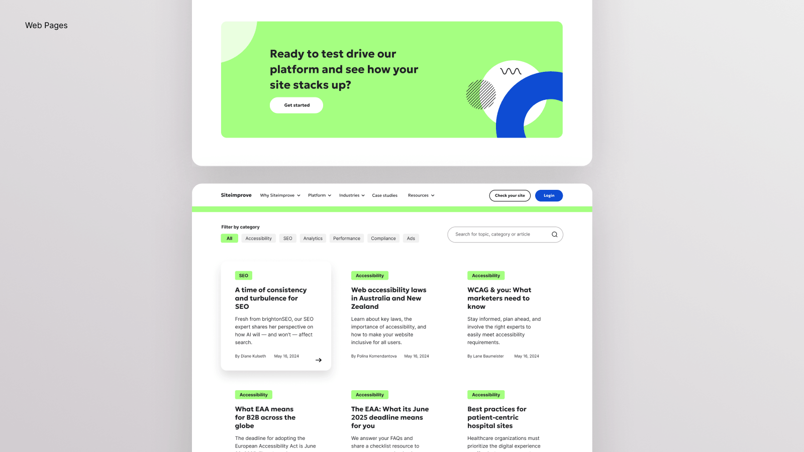
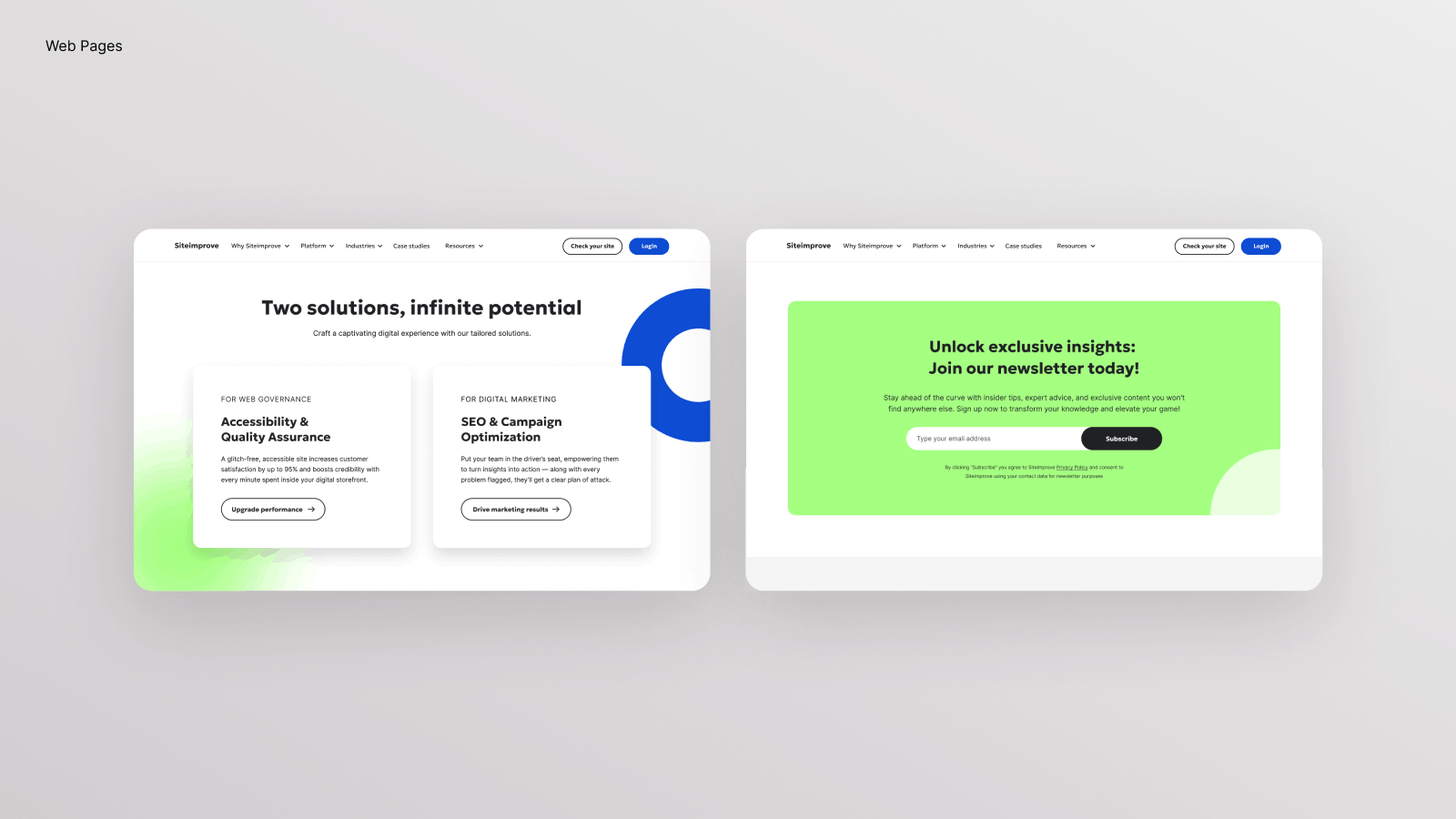
- Retained the signature blue to preserve brand equity
- Introduced a vibrant green to signal growth and innovation
- Designed a custom icon set and graphic elements to enhance recognition
02.
Digital Experience
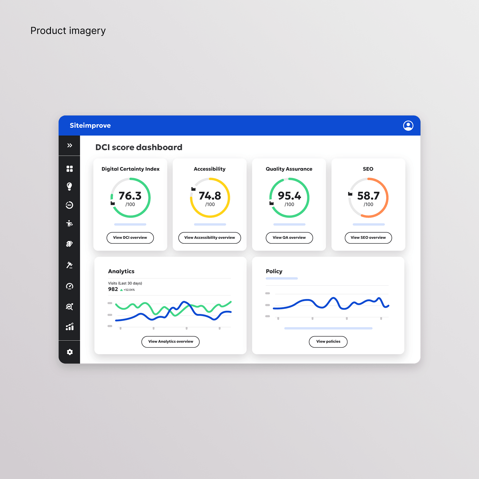
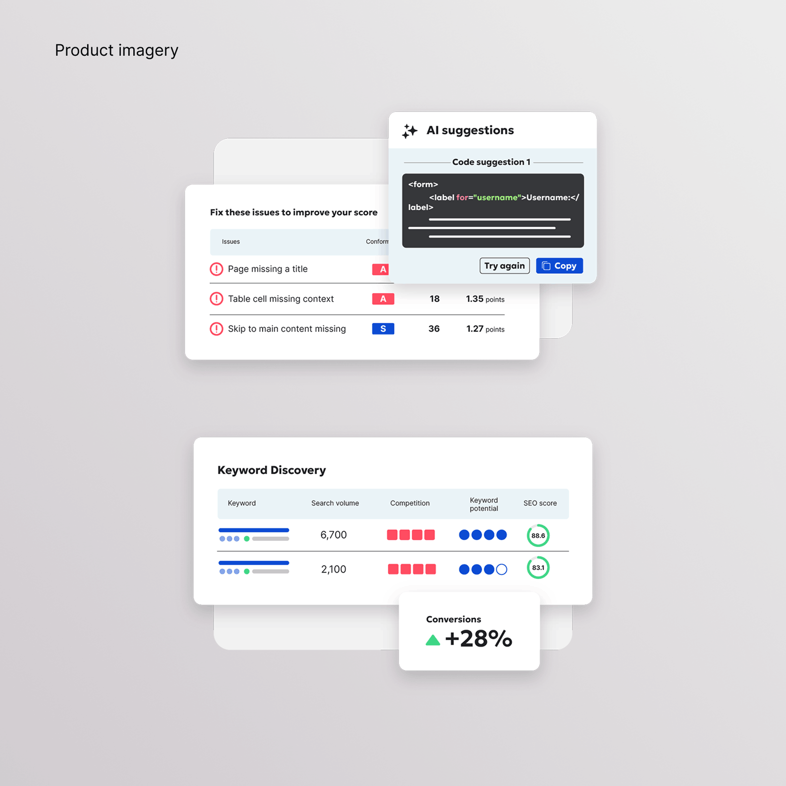
- Designed high-fidelity mockups in Figma for all key pages
- Focused on clear navigation and content hierarchy
- Ensured a consistent and accessible UI system
03.
Design System & Guidelines
- Developed a comprehensive Corporate Visual Identity (CVI)
- Created brand guidelines for cross-team alignment
- Delivered templates for marketing, product, and internal use
04.
Strategic Pillars
- Shifted to a platform-first narrative across all touchpoints
- Adopted an outside-in, customer-centric perspective
- Simplified communication to improve clarity and overall understanding
Impact
The rebrand significantly improved how users understand and navigate Siteimprove's offering. By simplifying the structure and clarifying messaging, the platform became more intuitive and aligned with customer needs. Internally, the new visual identity and guidelines created stronger alignment across teams, enabling more consistent and scalable communication.
Results
Following the website relaunch, performance metrics showed clear improvements:
increase in search impressions
increase in organic traffic
increase in conversions from organic traffic